Two simple brick motifs ƒ “wozówka” and ƒ “rolka” sufficiently decorate the simple clinker walls.
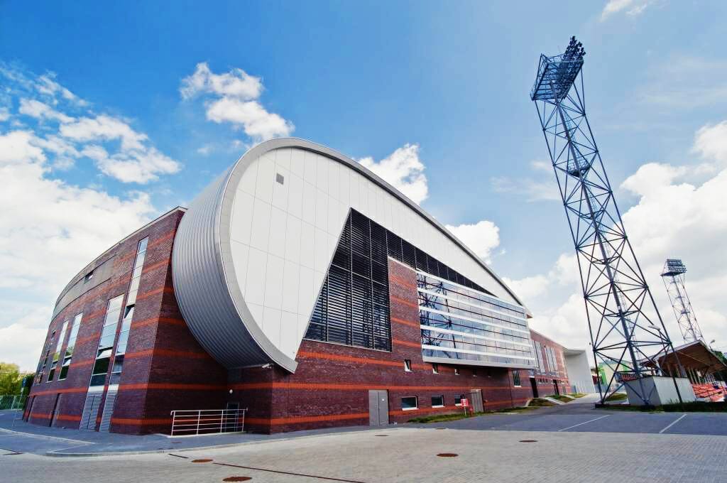
In 2009 – 2011, in cooperation with the Budimex-Dromex consortium, we managed to implement another large and very complicated topic, which was the construction of brick facades of the new Sports and Entertainment Hall “KSZO” in Ostrowiec Świętokrzyski. The highly complex design of the building with a construction area of more than 10 thousand square meters (volume of 75 thousand cubic meters) was created at Janusz Pachowski Design Studio. Once again, a very difficult task was set before us.

Large facade areas force absolute perfection in facade routing, here there is no room for even the slightest error.
The junction of adjacent brick facades always sets the bar high for a facade contractor, especially a brick facade. At this point, any error will be immediately apparent. Volume – Style clinker facades. On the one hand, the designer has created a composition made of a number of altogether simple, though non-trivial solids, but on the other hand he has taken care that no element is set at right angles to the others. This made cladding the sculpted concrete structure with clinker bricks quite a workmanship challenge. If we add to this the enormous scale of the facade area, the numerous bevels, splayed planes and the brick threads assumed by the architect, it is clear before what a great challenge our team had to face. The material for the facades was chosen in this case not by accident, and the brick clearly emphasizes the importance of the investment as the main indoor sports facility in Ostrowiec Swietokrzyski.

The large and very long facade requires a very high degree of accuracy in accounting for the vertical layers of brick.
The color composition of two models of brick from Roben ‘s range, chosen in this case, further emphasizes the monumentality of the establishment. The large dark planes of “Adelaide’ ‘ burgundy smooth interspersed with intense red horizontal stripes of brick laid on a standing roll give the huge squat building a sense of rhythmic lightness. Huge stretches of visually rather heavy brick facade in a very haphazard manner pierced once with large once with small glazing make it clear that the primary purpose of the facade is to illuminate the rooms, and the appearance here is only derivative of function. Nevertheless, the whole building gives a very pleasant impression of stately lightness, as if it had been created in a sculptor’s studio rather than on a drawing board and vector graphics programs. Arches, curves and rounds are shaped very efficiently on paper. However, each time, mapping such non-geometric forms in the brutally hard and therefore difficult to work with brick posed a considerable challenge.

Routing facades with walls 50 meters long is a huge challenge for people and equipment.
When choosing a contractor for this type of facade work, the pricing of the work is rarely the deciding factor. Here, as everywhere, the price translates into the quality of the work, and any general contractor or developer knows that the cost of improving such large areas is astronomical. The work should be entrusted to professionals with an established position in the market and experience confirmed by realizations. A major complication was one of the project’s assumptions providing for the seamless weaving of red facade detail into the uniformly straight planes of the walls. The horizontal red stripes established in the project set on the so-called. \“Standing roll of Melbourne” were recalculated in such a way that three vertically aligned pieces had to go over each horizontal brick. I suspect that several of our full-time masons had night terrors about it.

Façade bricks going into the interior place great logistical demands on the contractor, a pallet of bricks can weigh up to 1.6 tons.
A pleasant addition to the complex façade work on the building and, incidentally, a nice finishing touch to the whole order, in this case, was the cladding of most of the interior walls of the complex with straight laid Adelaida burgundy bricks. Here it was enough to fit between the vertical corners of the walls, the floor and the ceiling. In fact, with the scale of the complexity of most of the work and the masonry of the semi-circular facades, masonry work in the interiors was actually a proverbial piece of cake.

by Adam Poojewski


